Im now doing a website design. They have given me small amount of info for the website but can able too still make it interesting.
Put the main logo on the homepage with the information about country cakes.
Then some more info about the company.
What cakes they sell and information about each cake.
page what the have have won
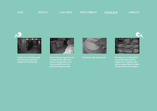
How they make there cake.
The layout is slightly boring need to be more interesting but simple.
Lining the link pages and the message and putting the logo at the top. really makes it spacuse and easy to understand.
This looks slightly to random and doesn't make much sense.
having the logo in the corner improves how it is presented the eye looks at the logo straight away and then downwards to the link pages and across to the message.
Having the logo and message centred really makes it more perfesional and also I think it looks better for the link pages at the top it seems more structed.
This page makes it more neater and more organised
Maybe these images are to small and should be look bigger.
To make it more decreative I put some patterns around the messafe like a frame. Makes it more cakes like cake and countryside.
Might to big and distract from the rest of the images.
Having it small makes it lot better and frames the whole image.
Again too big.
Again making it small works really well and is not too distracting from the rest of the page.


No comments:
Post a Comment