I'm a lot more on track with my work and development constantly updating my blog with research primary and secondary work but also looking back of what I have done an constantly questioning my work.
From my design context book it was about focusing on simple design and I think it comes across on my work for example my country cakes logo looking organic and country with the right colours and context. This also shows in the Musical Film Festival logo using the colours from my screen shots of musical posters and making typography notes linking with the celebration on musicals with shapes and colours.
The main problem I had was trying to finish the Country Cakes product. I had many problems receiving emails and phone calls from country cakes it came to the point I was getting no where and at times didn't get a reply for 3 weeks. This came came to the point that I created my own work and made my own discision. I gave them ideas of packaging for each flavours of cakes and prices of packaging large and slices but no replays. So I produce the one cakes box colour and produced a website and flyer.I was very dissapointed how this didn't get done but felt I could do much about the situation and moved on.
The end of year brief was the most enjoy able it was the most challenging brief , but a great problem solving trying to create a folding technique that would reveal the word reveal. The quality of my flyer/poster final product was really high and was impressed what I produced in that week. Felt that this was the most professional piece of work I have done.
I t was a slow start with my king cobra brief and not really sure want to do with them first but when I saw Sylvain Allard's paper design around the bottle it made it a whole lot more interesting and creative for what I could do with that and gave me the idea of making the label as a snake. What I did was a slow process and took slightly longer that expected but I am happy with the result espanding it to different occasions. I tested a lot on colour which would suit theme of each occasion. But the end result I am impressed but improve the quality of the work.
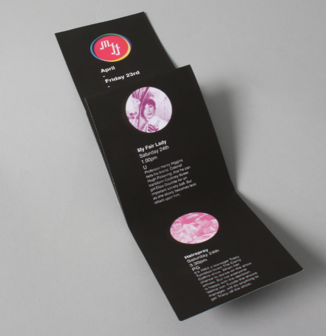
At the beginning of the brief i don't think my design where really working yet as a poster, it was of the musical into typographic imagery. After the crit it became clear that I could make a logo for it I then developed it into music notes and played with colour which would suit it. I also made sure the flyers looked like film being thin and black. I waned to image the larger flyer in a1 then folded but couldn't print back to back.So I had to make as a2 which is ok but I feel the the typography is too small to fit in the flyer. When I almost finished the brief some one notice that it looked like it said 'muff' so I quickly changed it with dot as music notes between each word. I think its one of those things thatI wouldn't of notice unless some one told me and i had to change it.
Perfume was a simple brief to create book covers.But became a longer brief because I exstended it into book marks, posters and book stands. I felt that this brief was the least challenging out of all of them.
The considerations I needed to think about is how it would be presented at a book store which I got great primary research from and understood from how you would present it at a shop.
Revise was a very difficult brief to do and I'm still the too sure about it I have had mixed reviews with it and felt that I could of done more with it and expanded the brief and create more designs.
Shakespeare sonnet didn't o very far and felt I took too many briefs that this was but on the side and was forgotten about.So I dropped it and moved on to the next brief.