Christmas:

I wanted to test the colours for the label. Rather than the orginal cream coloured background weather testing other colours would suit it better. The reds make it feel more festive, the red, gold and black really work well as a set.
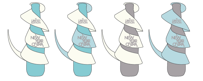
New Year:
The black might be to strong for this theme. I only want a small amount of silver and a lot more blue.
Halloween:

Orange and purple together is too much of the contrast. Purple and black look fantastic between the two still looks like
Halloween even without the orange.
The back label makes it look more like
Dracula with a cape. Looks like it should have fangs!
Pinks work best might look way too girl though and sickly. But he out of all of the them the two shades of pink work the most.


No comments:
Post a Comment