Wednesday, 28 April 2010

Photographs

This is poster 1:


A3 size poster folded into A5. A message to the school pupils.


A strong message.


The question might just be way too small.

Poster 2:


Used another bright colour. Green orange seemed the most appropriate.


Again typography to small. Put i personally like the simpler white design typography. I think its just my style of me working as simple design. The salt pepper vinegar typography is too busy for me but it works for this poster though.

poster 2


This is the next poster kept this simple and makes sense.

Poster

I have change it just into a poster. Just works a whole lot better a squashed together.


The typography being black and bold really make sit slightly tacky. Needs coloured background


Grey improves it's design but grey might not be the right colour. Looks boring and need to be fun.


A creamed yellow background works the most for background the typography suits it the most.


Yellow shade stock would work well to print. The typography on the left doesn't make senses.


Having the line underneath the title separates it but could be better at the top.


I slightly prefer this with the line at the top with the typography on the left.


Centred makes more sense as the design .Having the typography smaller makes it look like a exam question.
reviseThe next step is too fit the fold out poster. So i am testing out layout and typography how it would look like unfolded.


Even thought it folds open so it needs to be spaced out but looks a not right all all like this. Looks really boring and out of place. and not sure with the title.


I made a slight change by underlining the title. Still really not right.


Textured look slightly better but has made it look slightly western.


I made typography bigger and closer together. It does make it loads more interesting all squashed up. Title head line not right for the theme.

Improvement


This is a lot more 3d and real also looks a lot more professional as well. The sutler shine of the top of the typography helps a lot makes look more curved and shine effect.


This is meant to like it is squeezed out of a tube but doesn't exactly work compare to the design above.


I added more dots to make it look more like salt with different sizes of circles. I also make the typography similar to the mustard style to make more fun typography than rather structured.


Pepper also look great but does it look like doctor pepper logo?

Making the typography look like vinegar colour its very difficult.


Looks like chocolate . Too dark brown makes its look like a chocolate advert.


I put a slightly brighter brown in with orange but this look like toffee.


Again even more than toffee.


The white inside the vinegar typography is too light.

Early ideas

Name the four seasons? Salt, Pepper mustard and vinegar.

I have been creating decorative typography just like the photography I did I think I prefer the illustrations because its easy to move and play around with and its impossible to control vinegar to spell vinegar.


I wanted to make a splodge effect with the typography which you see in my design context blog.
Colour does look like mustard but needs to be more worked on.


Used the outline of helevetica to create pepper shape typography.
I made it look darker by putting black outlines around the circles.

I taken away the black circles but you can't see the detail.


The outline makes it a lot better.


The typography is not splodge enough looks to controlled.

Tuesday, 27 April 2010

Stand 2 & 3

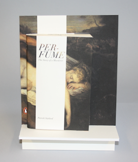
I have two books similar colour and used the bottle shapes. But thought this book stand would work for both of the books.


This might be difficult to pick up why there is a huge perfume shape bottle when there is a little perfume shape bottle might not fit together.


I find this might work better maybe if the board had shape bottles on the stand board but this might be to busy.

Book Stand 1


This is one of my book stands. I designed very simple and the same image at the sam place.
It was seemed easy to produce and good idea to exspand with the product. Thinking of doing book marks for them as well to go with a set.


Having the stripe lined up with the book and the image fits well presenting the book and image.

Snakes shapes


From my first my mocks ups I choose this style out of all of them. Its easier to construct but I will need to make the snake skails smaller and improve the cobra shape to make it look a like cobra.


I reprinted and re wrapped the snake to get a better design. I really like the concept but its going to be difficult to produce.

Typography Title

I am looking at title typography styles that will work for all questions.


Bambi


Ballpark Weiner


Helevetica bold


Helevetica Neue

Caviar Dreams